Local, Host
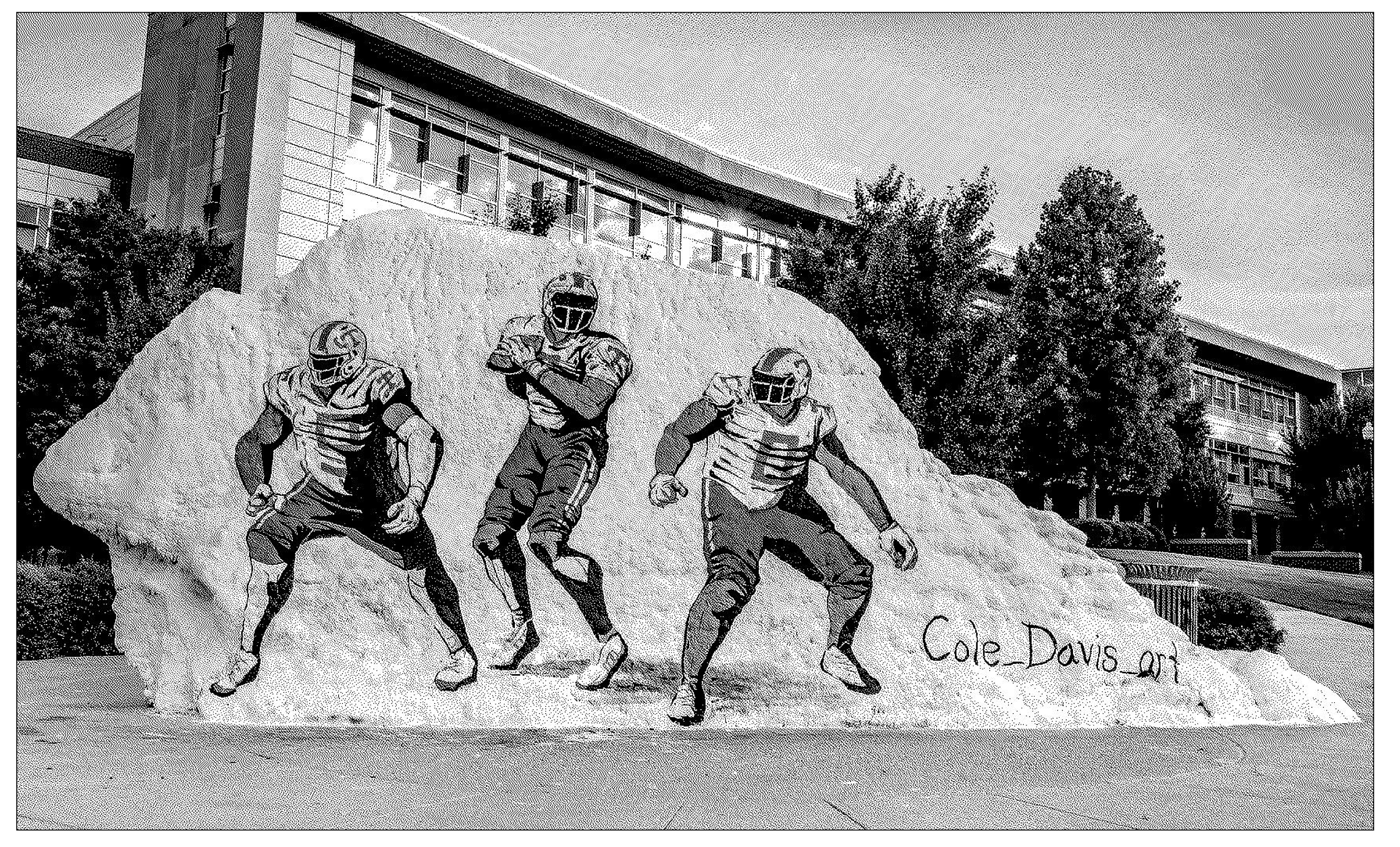
The Rock first formed 500 million years ago. In 1792, they named it "dolomite." In 1908, they built a church on the Rock, and they dug it up 58 years later, when they built Fraternity Park. They renamed it "The Rock," and began painting it in 1980. They dug it up again in 2009. The layers of paint melted off in 2015. Over the years, they painted memorials to Pat Summitt, wedding proposals, and Smokey. In 2019, responding to hate messages spray painted on the Rock, they started to videotape it for the internet.
The internet hosts information for a public. Stripping back commerce, CSS, and Javascript, the "world wide web" essentially sends and receives messages. It is one global Rock, which is where we'll begin this semester.
For this project, I want you to make an online publication that includes ten or more pages. Think of these as layers of messages, each page offering a new strata of html (or "HyperText Markup Language"). At least one entry should come from an offline source, which means you are publishing this text online for the first time. Your zine should be designed for a specific, defined audience.
We're going to start small and build. For five weeks, we'll be making many versions of just one or two entries, using different combinations of HTML and CSS. Then, you'll have two weeks to pull the project together with a navigation system, coherent design, etc. We will learn how to "push" this design to Github, and "host" it on the internet — introducing a new "rock" to the online ecosystem.
Requirements
- At least ten pages.
- Site should work on all screen sizes, including mobile.
- Site should have some idea about translation.
- Site should include at least one piece of content that has never been published online before.
Learning objectives
- Getting to know HTML and CSS.
- Experimenting with typography and graphic design in the browser. For the first few weeks of this project, we'll be using ONLY type.
- Thinking about how users navigate a website.
Extension
- Scale it up— instead of 10 pages, your zine could have 100. Or what if your zine was in more than one language?
- Design it for a specific device or format— What if your zine was designed to be viewed on a touch screen (like ipad), or meant to be viewed both online and printed out (using print styles)?
- Think about how users will encounter your publication— you could build a kiosk to view your zine in a specific physical place, or design it to be seen at a specific time of day. Or what if your zine was hosted locally, or on a peer-to-peer network?
Schedule
- Level 1: HTML
- Find three texts that you might want to include in your zine. For each text, make an HTML page using only the tags listed below. You'll have three webpages for level 1. The idea for these first few levels is to experiment with typesetting in HTML, as opposed to aiming for legibility.
<p><br>
- Find three texts that you might want to include in your zine. For each text, make an HTML page using only the tags listed below. You'll have three webpages for level 1. The idea for these first few levels is to experiment with typesetting in HTML, as opposed to aiming for legibility.
- Level 2: HTML
- For each text, make an HTML page using only the tags listed below, in addition to those used in level 1. Remember you can put a tag inside a tag!
<div><span><p><a><h1><h2>,<h3>,<h4>,<h5>,<h6><em>,<b>,<i><ul>,<ol>,<li>
- For each text, make an HTML page using only the tags listed below, in addition to those used in level 1. Remember you can put a tag inside a tag!
- Level 3: CSS Typography
- For levels 3 and 4, add two additional texts; you should be working with five all-together. Going forward, you can also use any HTML tags.Make a version of each text using only the following CSS properties. The idea here is to experiment with typesetting in the browser. Don't worry about creating a coherent visual style quite yet... for now, it's more important to see what's possible using these properties only:
- font-style
- font-weight
- font-size
- font-family
- text-align
- text-transform
- line-height
- letter-spacing
- For levels 3 and 4, add two additional texts; you should be working with five all-together. Going forward, you can also use any HTML tags.Make a version of each text using only the following CSS properties. The idea here is to experiment with typesetting in the browser. Don't worry about creating a coherent visual style quite yet... for now, it's more important to see what's possible using these properties only:
- Level 4: CSS Box model
- Make a version of each text using any HTML and the following CSS properties. What types of layout can you build only by changing the size of various elements?
- padding
- border
- margin
- position
- display
- float
- top
- right
- bottom
- left
- height
- width
- Make a version of each text using any HTML and the following CSS properties. What types of layout can you build only by changing the size of various elements?
- Level 5: CSS Layout
- For each text, make a version that uses either CSS grid or Flexbox to create complex, multi-column layouts.
- Try adding multimedia content using <image>, <video>, <audio> or <iframe> tags.
- Try a few different layouts. What makes sense for your content?
- For each text, make a version that uses either CSS grid or Flexbox to create complex, multi-column layouts.
- Level 6: CSS Animations / Transitions
- Choose one version you already have of each text. In each version, add some interactions or animations using CSS. What types of hover states or movement might enhance your content? I'm curious how you can expand your design palette to include motion.
- Level 7: Media Queries
- At this stage, we're going to begin refining the designs of your collection into a coherent set.
- Identify one page you've made so far that feels like a good example for how you might want your zine to look.
- On that pages, add media queries so the layout looks good on screens of every size. What creative opportunities are there within responsive design?
- Level 8: Navigation System
- Build out at least five pages of your zine. Remember, your final version should have at least ten distinct web pages.
- Then, draft a way to move between the pages. Think of a metaphor for navigating your zine. Does it work like a book, a map, a timeline, a maze, a dérive, a list, a restaurant menu, a game, or... something else?
- Final Draft
- Create a final version of your webzine. Your zine should include:
- A title. Use the
<title>tag! - A favicon.
- At least ten individual pages.
- A way to move between pages.
- A title. Use the
- Additionally, it could include a cover page, an about page, a bibliography, or any other additional front/back matter.
- Create a final version of your webzine. Your zine should include: