data, base
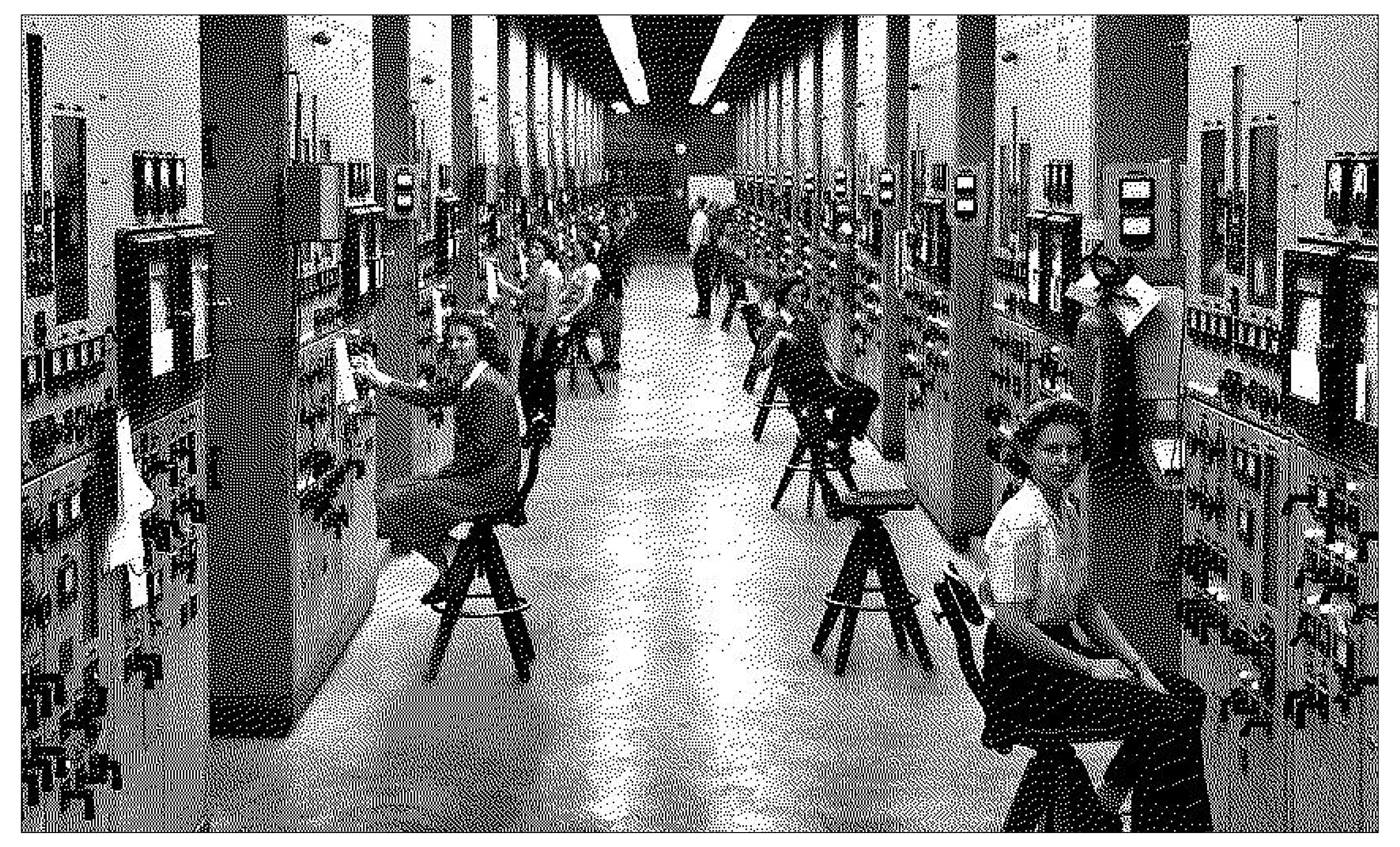
At the shoals of Melton Lake, Oak Ridge Laboratories has been developing new technologies since the Lab's inception in 1943. The lab has studied nuclear energy, material science, and in 2019, Oak Ridge built the second most powerful supercomputer in the United States: Frontier. Frontier can process calculations of enormous complexity, which allows us to simulate entire systems—not just small pieces. This computation enables things we can’t physically test, like simulating a new drug before human trial, or modeling climate decades into the future, or testing materials under extreme conditions (like inside a reactor). The true genius of Frontier lies in it's capacity to organize this massive amount of calculated data. It's a massive content management system.
For our purposes, supercomputer and a design system (like Cargo Collective) both solve the problem of scale by breaking complex tasks into smaller parts, standardizing how those parts behave, and coordinating them into a larger, coherent system.
We began this semester by getting to know you through HTML. Now, I want the world to know you through your work. Now it's time to build your own corner of the internet, for you to act as your own Frontier, by using a Content Management System (or CMS). A CMS allows you to:
- better manage your files
- design using a WYSIWYG ("What You See Is What You Get") system
- easily host and update a portfolio.
For your site, you can share your work in itself or be subtle or loud, overwhelming or restrained. Consider how your work will be best presented in the context of this online catalog.
Project Parameters
- Your name
- Documentation of work from this class and at least 5 other projects (either in the form of a video, screenshot, iframe, gif, or textual list)
- Name of each project (optional 1 sentence description)
- Link to each live project / website
Schedule
- Level 1: Compose
- Start by collecting all of your work that you'd like to showcase in a portfolio. This can be as polished or as process-oriented as you'd like it to be. Please share your work from class, and at least 5 other projects from last semester or last year. Think of this as your public facing archive of you work!
- Level 2: Sketch
- For this project, you will start from a desktop-first approach. In Figma, create three (3) 1440 px wide frames. Design a distinct system for each. The particulars of each system are up to you, but consider the limits of the frame width, and the length of your text as constraining factors.
- Level 3: Prototype
- In Figma, you will refine one of these approaches by developing a mobile and tablet approach. Please remember that your work should be the primary focus (Don't "over-design").
- Level 4: Finalize
- Choose one of your grid systems to flesh out with Cargo Collective, a CMS that is specifically useful for designers. When you are ready to host, I will give you a discount code that will make public sites free for UT students.